MOZILLA vs I.E
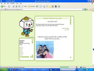
i notice my blog layout looks very ugly in internet explorer...
(OKAYE IM NOT HINTING YOU P33PS OUT THERE THAT MY LAYOUT IS PRETTY BUT PEOPLE WITH AVERAGE INTELLIGENCE WILL UNDERSTAND WHAT I MEAN RIGHT.)
so anyway, lets compare how it looks in mozilla & internet explorer
mozilla firefox:

internet explorer:

see what i mean? the scrollbar at the links box has a horizontal one which makes the box looks like it has tons of scrollbars. HAHAHAHAH .
okay nevermind me i was laughing at how i described it.
but in mozilla it looks perfectly fine! hmmm.... this is indeed queer but am i going to do anything about it?AM I? AM I GOING TO GIVE A @#$%^&*( ABOUT IT???
NO PEOPLE!!!!!!!!!!!!
NOOOOOOOOOOOOO.
(OKAYE IM NOT HINTING YOU P33PS OUT THERE THAT MY LAYOUT IS PRETTY BUT PEOPLE WITH AVERAGE INTELLIGENCE WILL UNDERSTAND WHAT I MEAN RIGHT.)
so anyway, lets compare how it looks in mozilla & internet explorer
mozilla firefox:

internet explorer:

see what i mean? the scrollbar at the links box has a horizontal one which makes the box looks like it has tons of scrollbars. HAHAHAHAH .
okay nevermind me i was laughing at how i described it.
but in mozilla it looks perfectly fine! hmmm.... this is indeed queer but am i going to do anything about it?AM I? AM I GOING TO GIVE A @#$%^&*( ABOUT IT???
NO PEOPLE!!!!!!!!!!!!
NOOOOOOOOOOOOO.

0 Comments:
Post a Comment
<< Home